

NVISION Brand Refresh
As Lead Graphic Designer at NVISION, I partnered directly with the CMO and Marketing Managers to develop and implement a refined brand system across 125 locations nationwide.
The Challenge
NVISION’s previous visual language relied heavily on polygon textures, grayscale palettes, and imagery constrained within geometric shapes. While modern in intention, the system unintentionally conveyed limitation — viewing life through a narrow or fragmented lens — which conflicted with the organization’s mission of delivering clear, expansive “vision for life.”
At the same time, the company was growing rapidly. Leadership needed a visual system that could scale across locations while modernizing the brand and strengthening emotional connection.

Strategic Direction
The objective was clear:
Reflect the “limitless possibilities of clear vision.”
Create a modern, human-centered identity.
Develop a scalable system that could unify 125 locations.
Shift photography toward a photojournalistic, real-world perspective.
The brand needed to feel expansive, clear, and confident.
The Creative Shift
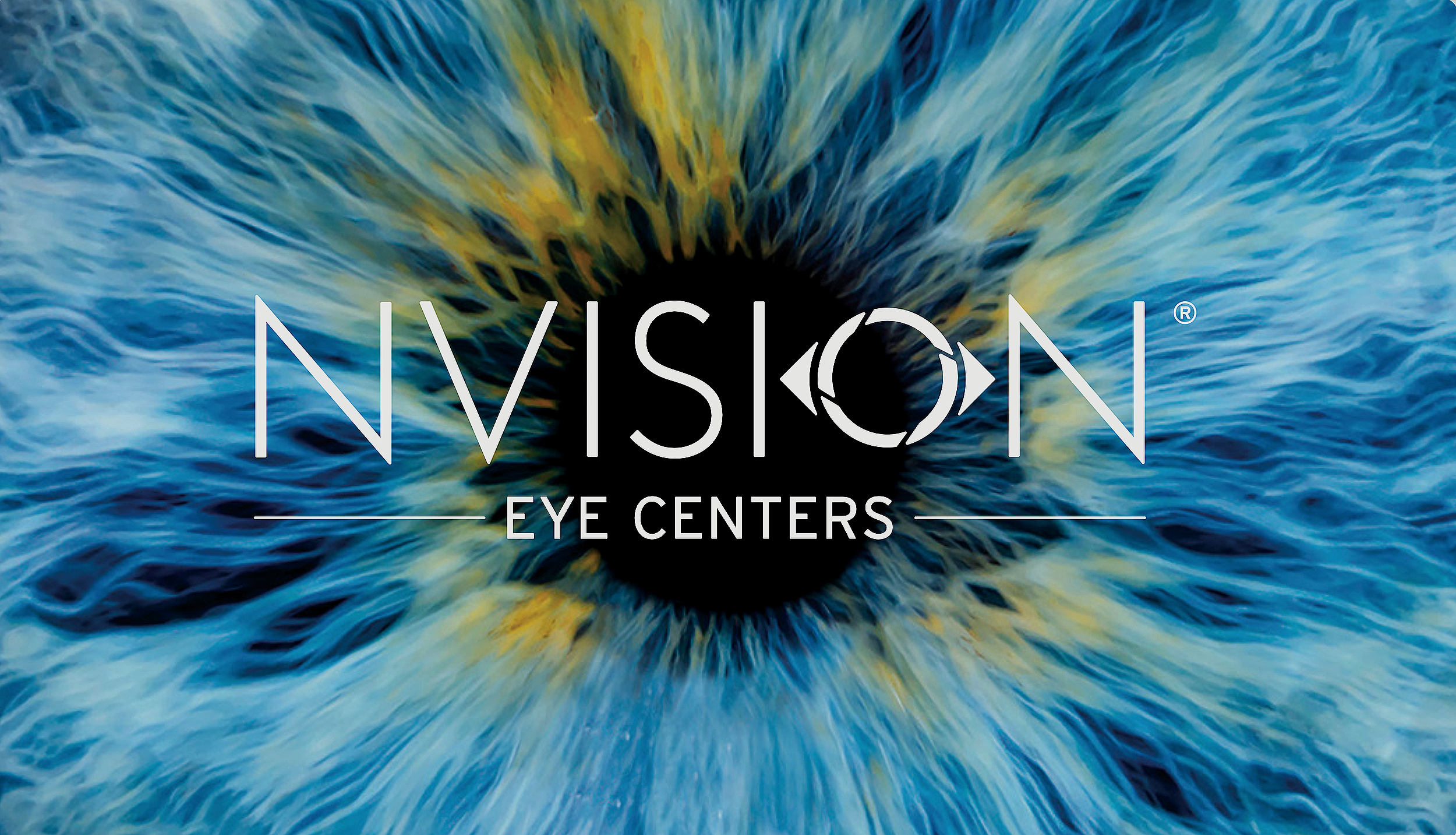
The new direction centered on the human eye itself.
Drawing inspiration from close-up iris textures and artwork displayed in the Newport Beach flagship location, I built the visual system around high resolution iris photography and organic color depth.
The iris became both metaphor and texture:
Vision as our identity.
Depth as possibility.
Clarity as experience.
A blue iris was selected to align with the existing brand color while reinforcing blue’s associations with trust, stability, and loyalty — key qualities in healthcare.
The result was a visual system that felt human, dimensional, and expansive rather than confined.
System Development & Implementation
I developed the comprehensive brand book, defining:
Color systems
Typography
Photography direction
Texture usage
Layout rules
Visual hierarchy
From there, I translated the system into a full suite of collateral, including:
Surgical folders
Brochures
Appointment cards
Patient booklets and guides
Posters
Business cards
Email templates and signatures
Surgeon bios
Marketing catalogs
All materials were redesigned to be modular, consistent, and easily deployable across 125 locations nationwide.
Constraints
5-week implementation timeline from concept to rollout
Sole in-house designer
Multi-location coordination
Ongoing leadership review cycles
Recently hired into the organization
The system had to be both elevated and operationally efficient.
Outcome
The refreshed brand created:
Stronger cohesion across all centers
Clear alignment between messaging, visuals, and mission
Simplified scalability for future marketing initiatives
A modernized identity rooted in clarity and trust
The shift positioned NVISION’s visual language to better reflect its commitment to vision care while supporting continued national growth.
What This Demonstrates
This project reflects my ability to:
Lead brand evolution within complex organizations
Design scalable systems, not just individual assets
Align creative direction with strategic business goals
Deliver under compressed timelines
Build modular, functional design infrastructure